Understanding Information Architecture
I love helping people to make sense of messes. As a professional information architect, the people who come to me for help have messes so big that they often believe that it is not able to be waded through.
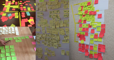
These are some pictures of the messes I have helped to make sense of in the last year alone.
I am deeply aware that not everyone has the want (or the stomach) to deal with messes this large, but that doesn’t change the fact that all of us, no matter what our jobs or goals in this world, face messes we must make sense of. In fact, the world is messier now than it ever has been before. Even scarier to think on is the idea that tomorrow the messes that exist will have become even more messy. Because like broken windows in neighborhoods or barnacles on ships: with time, messes only get messier.
There is a material that is to blame for most of the messes we as designers and technologists face. This material is not new to the digital world, in fact it is as old as humanity. Yet it is one you are probably asked to deal with more and more everyday. This material is called information.
The tough thing about understanding information is that it isn’t like other materials we are taught to use like brick, glass, or even pixels. Information is much sketchier to grasp and understand than those physical materials we have gotten used to wrangling. This is because information can be found in a lack of physical material as easily as from the presence of it.
In fact, information only exists in the heads of those that interpret our work.
I know this might sound like a lesson out of freshman philosophy class but bear with me here. Let’s take for example this picture from a bakery case.
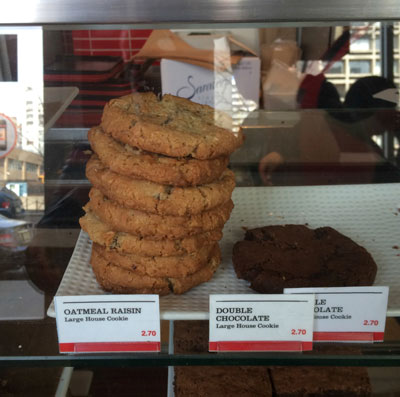
Many of you encountering this bakery case might make the decision that the oatmeal cookies are less desirable or purchased less often than the double chocolate chip cookies, because there are many more oatmeal cookies then double chocolate chip cookies. Many of you might also agree that there was likely at some point more than one double chocolate chip cookie on that plate.
But how do you know? Did you see those other cookies? Do you know the timeframe in which the cookies on both plates were last refreshed? No. You are assuming those things, so that you can go on with your day. And you likely don’t even know you are even assuming those things, even though these assumptions will affect what cookie you “feel like” in this moment. This subconscious consideration of options and interpretation of our surroundings is the only way to keep us from curling up in a ball of tears and indecision two minutes after getting out of bed each morning. Our brains have to fill holes in what we see and tell us stories about what is true so we can move on with our lives. We experience millions of moments like this everyday.
I like this example, because this bakery case is a perfect example of how the arrangement of content combined with the subjective data we individually have access to affects the information that a we create. Two users of this bakery case can walk away with two very different views on the same experience. The same content begets a multitude of information. One person might believe that the oatmeal raisin cookie is much less popular, while someone else could believe that the double chocolate chip cookie is much less fresh. Truth has no place here.
The moral of this story is that truth doesn’t matter as much as perception does and that information doesn’t exist without perception. Information is individual to the person doing the perceiving. This means we can’t make information, no matter how hard we try. We can only make content and arrange that content towards what we intend other people to believe. Our users make the information. This is not just a fact of bakery cases, this happens with everything we make for others to experience.
When I talk to my clients and students about information architecture, this is what I try to get across. Information architecture is the practice of deciding how to arrange something to support a specific intention. Information architecture is not directions for how something should look, but instead how it is intended to be perceived.
So today I want to share with you the three lessons I have learned as an information architect, that I think are most helpful when getting started in making sense of whatever your next mess is.
Lesson 1: Language Matters
The first lesson is that language matters. I find this to be an obvious statement to most, and yet it is also the hardest lesson for most organizations to turn into practice.
I recently worked on a project where there were 14 terms and phrases for the same thing. Now, it is important to note early in this story that no one would ever sit down and say “let’s think of 14 ways to say this same thing” —instead this is something that happens in different silos and then ends up in one user experience. One group decides to call something a clip, the other lands on the word highlight…a third adds the word video and 11 others decide something else sounds right for their purposes. This is the single most common ailment I see in my client’s information architectures.
This is impactful not just to those who produce content and functionality, but also those that manage databases, customer service calls, marketing and quality assurance. Because often when people get so many ways to say the same thing, they also assume that there is more than one thing being discussed. Suddenly it isn’t just a label difference, it becomes a model difference. It ends up in the scope of functionality that is being developed, it ends up in the navigation taxonomy and as different tables in the database.
Think for just a second about how many words you are dealing with in your latest project. Now think about whether or not any of them are actually synonyms of some other word you use. How would your world be different if these were all reconciled?
This happens to nouns as much as it does to verbs, so it is important to consider both. For example you might see edit used on one part of an experience and modify used elsewhere. There are hundreds of common examples like this. And each of those choice of label matter in how clear or confusing your user experience ends up.
To clean up a mess like this, you need to mine for nouns and verbs, and determine on a case by case basis whether you are dealing with a label change or if in fact a model change is warranted.
Now please understand that streamlining to just one label per model is not always the best direction, in cases of different contexts and users sometimes having more than one label for the same model can be the key to clarity. But it is still important to understand that this is a label change, so that duplicative models aren’t developed and maintained.
The goal is not always to simplify the language, although it is often needed. The goal is to know what you mean when you say what you say.
The tool that creates agreement among people about what things mean is called a controlled vocabulary. It isn’t complicated, or technical to develop, although it is time consuming and to be honest it isn’t very sexy to look at either.
This is just a list of words with definitions and rules for usage. But the power behind this list is that it is *the* list. No one is allowed to go against the list without changing the list by agreement of the team.
One of the most powerful parts of this list in my experience is not even the approved terms, but instead the “Things We Don’t Say” list. This list is full of the semantic dragons within an organization.
In my experience, every organization has these semantic dragons. Here is a list recently developed by 18f for the federal government. Whether they be legacy terms, internal language that confuses users or jargon inherited by an industry or context, the elimination of these words through circulation of a list like this can make major differences in almost any project.
Language is all around us and without rules for how we can use language consistently, semantic dragons will reign free and terrorize your proverbial villagers.
This idea might seem simple enough to not even be needed, but I have literally had clients and colleagues hug me on delivery of this document. It is often noted as the single most important thing I deliver, because it gives the team something to point to in determining what they mean when they say what they say.
Lesson 2: There is no right way.
I want to clue you in on a little secret. I am not actually an expert in organizing things the right way. I am actually an expert is getting people to agree on *their* way to organize things. This means that if you ask me a question about how to organize something, I will always answer with “it depends on what you want to accomplish.”
Let me give you an example. Let’s say we were working on a grocery store website. After some research into how people organize produce we might determine that tomatoes, squash, avocados and eggplant are not easily discovered by users when classified as fruit, which is how science classifies them. We decide, as Fresh Direct has here, to classify them instead as vegetables.

Think for a second about the impact to sales and findability if the designers at Fresh Direct had insisted on adhering to Linnaean taxonomic standards. No one would be able to find anything!
Now let’s say we are organizing a website to teach middle schoolers about scientific classification of plant life. Would we make the same decision? Probably not. Even if middle schoolers told us they believe these to be vegetables, to classify them as such would be misinforming the students, and progressing the prevailing idea that these are in fact vegetables, which scientifically they are not.
Simply stated, there is no one right way to organize anything.
It turns out that the organization of things is only correct in so far as it helps you to reach the intention you have set for whatever you are making. This means that some websites are architected to get you to pick up the phone. Some mobile apps are architected to get you to go to the desktop, some buildings are architected to get you to leave quickly. These may seem contrary to our ideas of “good experience” but it highlights an important idea, which is that the taxonomy that you choose for organizing something is actually one of our most powerful tools of rhetoric, it is a decision to be made, not something that “just is” or should be taken for granted or inherited from other circumstances.
One of the most common ailments I see in the development of taxonomies is what I call “corporate underpants” and we have all dealt with this before, whether in our jobs or as users of other peoples work. This is the term for when the content of something is organized not for the way users understand things, but instead is organized by who within the organization controls it. I see this all the time, in big and small organizations. I most recently saw this while working on a taxonomy for an ashram of monks.
The trick I use to get people over this ailment is to make them organize their “whatever” at least two ways before we decide how to proceed. So if they currently organize things by department, I make them try it by task, or audience or topic instead. This is a process of letting go of what we can sometimes assume is the only way to do something. Once we think of a new way we can decide which taxonomy gets us to our intent more fully. The truth is that I have never done this exercise and had people go back to their corporate underpants. Instead, it is often the case that once people let go of the thought that “this is the only way” we can move forward with a new and better way.
I also really love introducing card sorting with users to get options on the table. If for example, we were trying to figure out how to organize our grocery store website, we could use a card sort like this one to see how users understand fruits and vegetables.
The key is getting people to let go of there only being one way, to open up the possibility of new and better ways.
Lesson 3: We need pictures.
It has been my experience time and time again that without something to point to, people will just flounder in indecision, or even worse, schedule yet another meeting to hash it out. I have watched teams waste hours, days, months, even years not making progress because everyone was talking around something meeting after meeting instead of someone drawing a picture of the elephant in the room. Taking notes is not enough, we often need pictures to make progress.
As simple as it seems, making pictures of things allows us to all get on the same page and adjust our mental models accordingly. And I am not just talking about making wireframes and site maps. In fact, often the decisions we need to make are obfuscated by jumping to drawing the solution to an under defined problem. Instead, I am talking about pictures that allow us to discuss complex things without relying on people keeping up with in their heads alone.
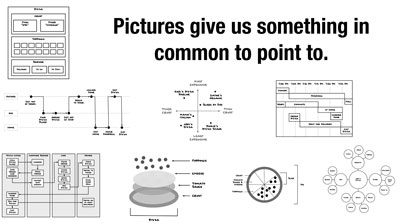
Here’s a trick to knowing a picture is needed, if you ever have a conversation or meeting with someone who is using their hands while they are talking, they are drawing a diagram in their head. You should make it your business to get that diagram out of their head and onto a piece of paper or a whiteboard as soon as possible, because when you add your own perceptive lens to the mix, it might not actually look the way you are assuming it does. In my experience simple pictures can release frustration and eliminate arguments.
Have everyone draw what they see in their heads and then compare them with each other, while making one picture everyone can agree on. Or if you can’t get people to draw, make a picture of what you see in your head and ask other people how it is different than what they see in theirs. These pictures are not pretty pictures to be presented or sold to others. The intention of these pictures is to change, so don’t be protective of them. These pictures are not of solutions or interfaces. They are pictures of problems and complexities to sort out.
With something to point to, we can reach agreement. Only when we have agreement can we move forward. Without agreement we will linger in a sea of indecision and assumptions.
One other little hint I have learned over the years: The person who picks up the marker first owns the project. So if you are looking for that moment to step up at your job, be the one who isn’t afraid to draw the monster that is in everyone’s head.
I hope you are walking away with three key lessons about information architecture:
- We need to know what we mean when we say what we say.
- There is no right way to organize anything, there is only the way that gets us to our intent.
- Making simple pictures of complex things is the key to agreement.
I also hope none of these steps feel like something you need a specialist to take care of. Because information architecture is not just for information architects. It is an important practice to understand if you are making anything for other people.
Before I leave you, I want to ask a favor of everyone in this room and watching this video at home. Please help the world be a clearer place by spreading the words “information architecture” to as many people as possible. Without a name for this important practice, people can’t get better at it.
It is my belief and hope that if more people understand the importance of these lessons, we can collectively make sense of the messes we face in this world.
Thanks.